8.12.10

Screen Printing

For the next project, which i've only just started is based on the work by  Brian Hubble. We first took an image of a street with interesting angles and houses. I took one from just around the corner from my house, it wasn't that interesting but i didn't want a lot of cars in my image from busy roads. I first looked at artists and techniques to try out and i found an artist called Jonathan Klassen which i looked at because i like his colour scheme and the way he has unusual surfaces. I Then painted over a collage of text from a newspaper with white emulsion, from the i started to add block colours to go behind the screen prints which will be done later on. I added texture using Klassons technique with a sponge adding white to create tones. I then added white lines to define some parts of the image, such as the pavement. Finally i created a sun with an orange pen and paint.

 
Some of Brian Hubbles work

Jonathan Klassons work

Some examples of my pieces using backgrounds i've created and an assotate of an image i took.

7.12.10

Final Book cover

 
After a while choosing which design i liked best, and rearranging images on the layout i finally came up with the design for the John Wyndham book 'the day of the triffids'.

1.12.10

Day of the Triffids


For My first illustration project we were asked to create our own triffid plant by using the descriptions from the book "day of the triffids" by John Wyndham. First of all i looked at pitcher plants and carnivorous plants in books and on the internet, i developed my ideas for the head of the trifid from these and added detail with quotes from the book such as the whip contained in the base of the head. I then started to sketch some ideas of the trunk and legs of the trifid, in the book it was described as the plant walked.


"When it "walked" it moved rather like a man on crutches. Two of the blunt "legs" slid forward, then the whole thing lurched as the rear one drew almost level with them, then the two in front slid forward again. At each "step" the long stem whipped violently back and forth; it gave one a kind of seasick feeling to watch it"

 I based the trunk on roots of plants and trees, but also looked at the shape of turnips and vegtables to see how they grow into the ground and how my plant could come from the ground. These are some examples of the sketches i've done of my ideas for the Triffid.

This is my final design for the triffid. I decided to keep the drawing rough to show the personality of the monster, which is menicing and creepy. I then added watercolour to them.


29.11.10

The yellow pencil


Ghostpatrol is an australian artist that i recently found while searching for pencils for a sketch i did last night!

18.11.10

Doe a deer a female deer

  
I've just completed some of signs for the new drawing project in Graphics. I've used the bar and resturaunt "Alma De Cuba" which is based in Liverpool. I've used elements from the interior and the logo to create staff badges and toilet signs, male and female.

The image on the top are some designs for the staff badges, i used a victorian style frame on the first examples which relates to the gothic style decor of Alma de cuba. On the second example i used the exhisting logo and changed elements and added the "staff" sign and the Alma de Cuba typeface .

We were asked to create toilet signs only using symbols or images, i decided to use deers as my signifiers for the toilets. The image of the doe above is for the female and the stag is for the male toilets. The shield behind the deer heads also again match the design of the shield on the logo. Alma de cuba is based in an old church which has been converted, however it still has its stained glass windows, so i decided to create my toilet signs from stained glass.

I still need to add colour to match the theme of the bar which will be done on computer but also i will try some designs out in watercolour.

11.11.10

wooly hair

A quick drawing i did from an image in a magazine, I first drew the outline with pencil then fineliner, and added black thread with glue to create the hair, i followed the natural lines of the hair to create a realistic look. I then manipulated the image on photoshop by adding colour.

Air art

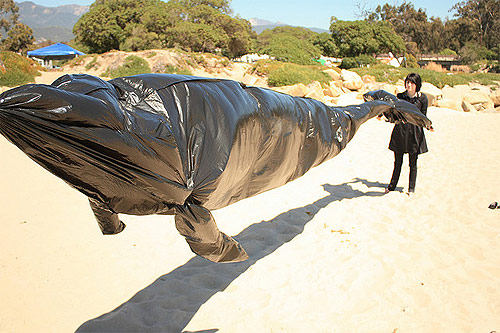
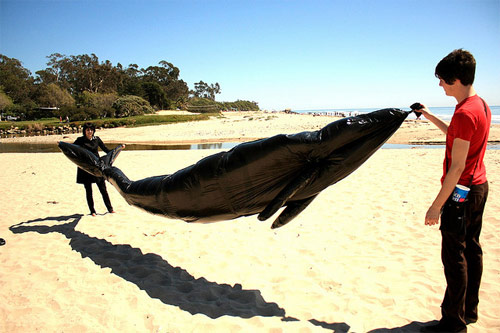
So today i found some images of an air whale made from plastic bin bags from a website. It looks like a pretty simple idea and the images came out really well. 

From that, i did some research on an artist i remembered doing something similar called Joshua Allen Harris who uses air vents to create a similar affect. He does this in public places and creates different characters using plastic bags, such as polar bears and lock ness monsters to lay ontop of the vent and when the air goes through the vent, the plastic bags are filled and become a 3d sculpture. I like the idea that when the bags aren't filled with air they just look like everyday rubbish found on the street, and they are brought to life with the air from subways and air in New York. 
His first piece of air art was the well known polar bear which became viral when someone spotted it in New York and posted it on youtube (follow the link above for the video). He then started doing projects such as "air apes" which are a selection of ape characters also made from plastic bags hung and attached to vents.
Work by Joshua Allen Harris

Another artist i found whilst browsing through some of Harris' images, is work by Mark Jenkins who creates street installation using  packing tape.  Although he doesn't use air, his sculptures relate to the work i've looked at. His work is considered as "designs to awaken passers-by from the comfort of their daily activities. Each lonely figure invites a response in the urban jungle, forcing those who see them to confront the thin veneer of civility that hides their inner-being". I especially like the image below of the dogs in the rubbish pile, the positions of the animals give them character and energy.
 I was thinking of doing something like this for my next project and i'll try and fit in somewhere. I like the idea of it being public and being art in a busy place rather than on a beach or in a secluded spot. If i can't fit it into a project i might just do it for fun to put it in a portfolio.

9.11.10

Varoom

Recently i've subscribed to Varoom magazine which i found from the AOI website. Its filled with illustrations, articles and interviews from the artists on the website, there's also a book which comes out every year filled with just illustrations which i was thinking of buying. Some of the issues are sold out and i can't get hold of them anywhere, but issue one can be viewed online so its all good :). It only comes out three times a year and hopefully i'll be able to get the rest before the next issue comes out.


I've also started another personal sketchbook which is more of a scrap book, the other personal sketchbook i made has really thin and can't paint on them without getting a hole in them. So i'm only gonna use that sketchbook for life drawings. I'm so confused on what i want to do, and i'm leaning more towards illustration but i have a feeling i'm going to do graphics. Atleast if i do choose graphics i'll have a personal illustration scrapbook to show that i can draw :)

31.10.10

Happy Halloween!

I drew this picture a couple of days ago and was going to add more colour in but i didn't have a lot of time :( But i drew Katy as a spider because i thought her outfit sounded cute.

28.10.10

Hot chocolate with a fox


Here are some images from my illustration project at college, my theme was based on the woodland, from this i used characters created with watercolour and fine liner that relate to the forest. We were told to create a menu mainly made from illustrations and for it to be handmade and personal.
First of all i started to experiment with watercolours and characters, then scanned and edited them on the computer. I also did some design ideas with fine liner for backgrounds and extra elements to decorate the menu with so there wasn't too much white space, for example; leaves, coffee beans, flowers, acorns and mushrooms (again based on my theme). 
I decided to use a textured background as my base, so i used tissue paper on the back and layered my drawings from the computer and the actual menu list. Finally i added material leaves and flowers to again add to the texture of the menu and to make it more tactile.


 The trees to the right of the menus are cut out from images of bark, and are there to show depth but also are the different sections to the menu.
I also added in coffee stains and tea rings to make the menu look as if its been on a coffee table and used as a coaster or napkin.

The back page is one of my favourite pages. i put my favourite characters on the back which are either drinking or with a hot drink.All of the elements i have used in the menu combine together on the back page to make it interesting.

Reflections project

In the summer holidays we were given a project to create a book on "relfection" to be interpreted in our own way. So i decided to base mine on reflections of shadows. It then sort of went off the subject and i did some drawings on victim and villian, but it still sort of relates in some way to the good and evil, the shadow light :/ 
Anyway i've scanned some images from my book to put onto my blog.
 
I started by drawing images from contextual links, this one is from a Gris Grimly illustrated book.

 
On this illustration in the book the shadows/monsters are seperated into different levels so that it look like the light is coming from the candle that the character is holding. I need to add more to it but i think it sort of creates that effect.
This is the first page in my book to illustrate what my subject is.
 I've only completed half the book so hopefully it will be done by the deadline :s if not then i could always add to it in time for my interviews


26.10.10

Moving Mouse


I've decided to put some images that i took from my past exam project for 3d design on 'animals'. I created some small mice out of plaster by waiting for it to set then carving characters from the blocks. I added recycled materials to add character, such as wire tails, tin can ears and copper wire limbs. I wrote a story about the mice moving into a new house/hole and put both pictures and the story into a small book that i made. The frames which i originally bought for the images, i decided to use them as small scenes picked from the story inside a deep frame. Once i was finished taking pictures i stuck them inside these frames which were then mounted onto the wall.

Here are some of the pictures i took of the frames which i created


These are some of my favourite images from the story book.

23.10.10

Amazing Maze

So recently i've been looking at a few illustrators online that have caught my eye. Most of the illustrators i have found use handmade drawings and scan them in to edit on computers, but i've found many that only use the computer. I wish someone would teach me how to use the computers to create pictures, hopefully they'll be able to teach me at uni.

Anyway, one artist i've found was Thomas Flintham who creates the cutest illustrations. He also creates some puzzles within images which is fun to do but took me a while :)
Here are some of my favourites:


21.10.10

Roadkill meatballs


I've created some small illustrations using watercolour and fine liner, my inspiration was from Kate Wilsons little bird illustration.
I still need to do some more editing and final touches onto them, such as text and maybe some other materials.

21.10.10


I don't really know how to start my first post as a blogger because i've never really written out my thoughts, i used to have several diaries but never was able to keep them up. The most i've ever written in a diary is maximum 10 pages. 
So i've decided to start a blog so i can trace back what i've done over past years and this year of art foundation, but mainly this blog is for my own use and to show illustrations that i have drawn in my personal collection (sounds proffesional but really its a cheap sketchpad with random doodles) 

I've got a lot to blog so expect spam!